Reflections on Designing and Running Visualization Design and Programming Activities in Courses with Many Students


Mathilde B. Bennetsen

Terese K. Høj

Camilla Jensen

Rebecca L. N. Jørgensen

Christian S. Loft
This mini site presents our EduVis 2023 paper, which comprises reflections on designing and running visualization design and programming activities in large courses.
Abstract
In this paper, we reflect on the educational challenges and research opportunities in running data visualization design activities in the context of large courses. With the increasing number and sizes of data visualization course, we need to better understand approaches to scaling our teaching efforts. We draw on experiences organizing and facilitating activities primarily based on one instance of a master’s course given to about 130 students. We provide a detailed account of the course with particular focus on the purpose, structure, and outcome of six two-hour design activities. Based on this, we reflect on three aspects of the course: First, how the course scale led us to thoroughly plan, evaluate, and revise communication between students, teaching assistants, and lecturers. Second, how we designed learning scaffolds through the design activities, and the reflections we received from students on this matter. Finally, we reflect on the diversity of the students that followed the course, the visualization exercises we used, the projects they worked on, and when to key in on simple boring problems and data sets. Thus, our paper contributes with discussions about balancing topical diversity, scaling courses to many students, and problem-based learning.
Supplemental materials
We present supplemental materials to support the thoughts presented in the paper. Doing so, we hope that they will be useful to fellow educators in designing and preparing their teaching and learning activities.
Teaching and learning environment for the course
We ran the course exercises across three rooms in the same building, each occupying up to fifty people. Two rooms (Room 1 and 2) were on the second floor, while the third room (Room 3) was directly above Room 1 on the floor above.
Since we knew that students rarely made their way to the course manager’s office, we decided to book a nearby meeting room the entire in-person day, which facilitated planning and work meetings in the teaching team. More importantly however, the room also facilitated ‘office hours’ that were conveniently located directly in front of the exercise rooms.
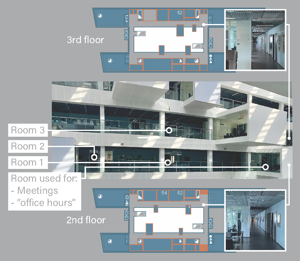
Figure above: Overview of Configuration of the physical learning context. The exercises were run in three different rooms with space for up to 50 people. These are indicated as Room 1--3 in the figure. In addition, many students opted to work at four-person desks in the hallways. These are partly visible from the miniature inserts. The floor plans show four public staircases, two of which are located in the middle of the building (an atrium, which is indicated in white in the floor plans).
Course intended learning outcomes (ILOs)
After the course, the student should be able to:
- Sketch novel data visualization designs and build interactive visualization prototypes.
- Explain fundamental theories and design principles in data visualization, apply them in a design process, and reflect on these.
- Interpret, deconstruct, and critique data visualizations.
- Reflect on the ethical and societal implications of data visualization.
The Intended Learning Outcomes are part of the official course descriptions available from our institution.
Course project and assessment
Students worked on a semester-long project in groups of four to five students. The project asked them to use Altair to create an interactive data visualization from a data set that they collected about their own lives and that they collected during the semester. At the end of the semester, student groups submitted a report of roughly 8–10,000 words that described their data collection and design process, as well as the visualizations they produced.
In addition to serving as a learning opportunity, the project report served to assess the students learning in relation to the ILOs. The assessment was carried out by the lecturer and two external faculty from an examiners corps recruited specifically for this task. Inspired by Evan Peck’s rubrics, we drafted five rubrics to guide the students in what to focus and the assessment of student work.
Project and exam materials
Design exercise overview and additional details
Below, we briefly describe each design exercise and its purpose in chronological order. Please see our paper for details on how we prepared for exercise and the observed outcomes.
Design exercise 1: Critique and redesign
The first design exercise asked students to deconstruct, critique, and redesign data visualizations.
Purpose
We wanted to provide students with an overview of the topic of data visualization and what concrete elements might be in play. In addition, since this was the first time students worked with visualizations, we wanted to students to experience how the same data can be represented in many different ways.
Teaching materials
Design exercise 2: Data collection and sketching
The second design exercise asked students to identify and organize data that was already collected about themselves and to then sketch visualization of the data. We divided the exercise session in two sections of 45 minutes. The first focused on data collection and pen-and-paper sketching, while the latter focused on student projects.
Purpose
We wanted to give students a sense of different opportunities for collecting data about themselves as well as how to externalize their data visualization ideas by sketching in hand. Secondly, the exercise came at a time when groups of students were starting to discuss the topic of their personal data visualization projects. Thus, the exercise served to kickstart this process by getting students to think about their projects, and to discuss it in their groups.
We used the knowledge students had gained from the first design exercise as scaffolds. Most importantly (and building on the first exercise), it relied on pen-and-paper data sketching. Additionally, it built on theoretical aspects of data visualization introduced during lectures and readings. In contrast to the last exercise, this exercise focused on data about themselves. The students were asked to identify pre-existing and -collected data about themselves, to organize it for themselves, and then to sketch data visualizations of this data.
Teaching materials
Design exercise 3: Constructive visualization
The third design exercise asked students to use Lego bricks to collaboratively create physical data representations and to evaluate these with their peers. We based the exercise on the Constructive VizKit (Huron et al., 2016; Willett et al., 2016) and the activities described as part of it.
Purpose
We wanted to give students a sense of alternative visualization materialities and their potential role in visualization design. Most importantly, with the co-constructive nature of building visualizations with Lego, we intended for students to experience building off each other’s ideas and to do quick experiments in the process of creating, destroying, and building something anew. Hopefully, to then gain a sense of working with the creative design process.
Teaching materials
Design exercise 4: Refining visualization ideas
The fourth design exercise asked students to use the 10 plus 10 sketching method (Greenberg et al., 2011) for a predefined data set as well as their own. Here student groups were to create a series of ten sketches, each focusing on a specific aspect of the dataset. Then, they would select one sketch to explore in 10 further sketches. The exercise encourages quick and spontaneous sketching, which helps to capture the essence of the subject with limited time. The sketches had to be done with pen and paper, thus facilitating familiarity with the datasets.
Purpose
We wanted to provide concrete approaches for students work with ideas. We facilitated this through experimenting with quick sketching within a time limit. Second, the repetition of the sketching process itself promoted familiarity and fluidity, facilitating a deeper understanding of divergent and convergent thinking.
Teaching materials
Design exercise 5: Sketching in the digital medium
The fifth design exercise asked students to consider the transition to digital tools, specifically RAWGraphs and Figma, for data exploration and visualization.
Purpose
The primary objective of this activity was to leverage the capabilities of RAWGraphs and Figma to enhance students’ understanding of data visualization and its digital applications. We aimed for students to create visually compelling and informative data visualizations using their own datasets or pre-existing datasets.
Teaching materials
Design exercise 6: Heuristic evaluation
The last design exercise (scheduled after the four programming exercises) asked student groups to perform a heuristic evaluation based on their own project and to team up with another group to do the same with them. We divided the exercise session in two sections of 45 minutes, the first focused on heuristics, while the latter provided time for project work.
Purpose
We wanted the last exercise to provide students with a capstone of their venture into the topic of data visualization and their project work. In addition, since this was the last exercise, we wanted to help students connect elements of the course to their previous, parallel, and future studies in their digital design study program.
Teaching materials
Programming exercise overview and additional details
After the first five design exercises in the course, we pivoted with a four-week deep dive into programming visualizations with Altair (Strictly speaking, one could argue this is about specifying visualizations, but we experienced that point falling flat with our student cohort of mostly design-students).
Below, we briefly describe each design exercise and its purpose in chronological order. At the end, we provide an overview table of the exercises. Please see our paper for details on how we prepared for exercise and the observed outcomes.
Over the four exercise classes (roughly two hours each), we introduced core aspects of Altair to enable students to use this technology in their project work.
The four exercises focused on:
- Introducing Google Colab, Pandas dataframes, and Altair;
- Domains and scales in Altair;
- Faceting and multiple views in Altair; and
- Specifying interaction in Altair.
The purpose of introducing a visualization library was (of course) to enable the students to create interactive, computer-supported data visualizations, which was both part of the course intended learning outcomes and necessary for students to learn to be able to hand in a successful project.
We decided on using Altair for mainly two reasons: First, most students followed an introduction to programming course based on Python in the previous semester. Second, since Altair is based on the notion of a visualization grammar, it nicely supports learning visualization theoretic concepts, such as visual variables and their efficiency.
General teaching materials for programming exercises
Altair Exercise 1: Introduction to working with Altair
The first Altair exercise introduced students to the fundamentals of Altair, enabling them to understand its core concepts and syntax. This exercise laid the foundation for their journey into the realm of data visualization using Altair.
At this point in the course, not all groups had gathered sufficient data for their project work. Thus, to ensure all students were able to do the exercise, we decided to base it on the cereal data set, which is available from the Vega project.
Teaching materials
- Exercise description
- Python Notebook used by TA’s during live coding
- Python Notebook for students to work in
Altair Exercise 2: Domains and scales in Altair
The second Altair exercise introduced students to domain and scales, and thus served to bridge theory of visualization variables with practice. While we had planned to introduce new aspects of Altair, our experience was that we needed to answer many questions similar to the first exercise, which obviously hindered students’ ability to move forward at the same pace.
Since many groups had not yet gathered sufficient data for their project work, we continued to use the cereal data set.
Teaching materials
Altair Exercise 3: Faceting and multiple views in Altair
The third Altair exercise introduced students to faceting and multiple views. This topic closely followed the preceding lecture as well as the structure of the second Altair exercise (first live coding, then independent work).
Since many groups had collected sufficient data for their projects to be able to work on the project at the time of this exercise, most groups used their own data for the exercise and only a handful of groups used the cereal data set.
Teaching materials
Altair Exercise 4: Specifying interaction in Altair
The fourth and final Altair exercise introduced students to specifying interaction in Altair. Again, this topic closely followed the preceding lecture as well as the structure of the other Altair exercises.
To our knowledge, only one or two groups were not ready to work with their project data during this exercise.
Teaching materials
Overview of programming exercise tasks
| Exercise | Focus | Task | Title |
|---|---|---|---|
| A1: Intro to Altair | Colab | T1 | Install the Altair library |
| T2 | Import pandas, numpy and altair | ||
| Pandas | T3 | Import the cereal .csv file into a DataFrame | |
| T4 | Display a single column from a DataFrame | ||
| T5 | Rename a column | ||
| T6 | Find the product with the highest and the lowest rating | ||
| Altair | T7 | Create a scatterplot | |
| T8 | Make the scatterplot interactive | ||
| T9 | Create other data visualizations | ||
| T10 | Make the data visualization interactive | ||
| A2: Domains and scales | Colab | T1 | Install the Altair library |
| T2 | How to connect to a shared folder | ||
| T3 | Import pandas and altair | ||
| Pandas | T4 | Import the cereal .csv file into a DataFrame | |
| T5 | Display the first five rows of a DataFrame | ||
| Altair | T6 | Changing colors of chart | |
| T7 | Create a scatterplot of sodium and rating, and make the color of the data points dependent on mfr | ||
| T8 | Change the colors of the data points in the chart | ||
| A3: Faceting and multiple views | Colab | T1 | Install the Altair library |
| T2 | Import pandas and altair | ||
| Pandas | T3 | Import the cereal .csv file into a DataFrame | |
| Altair | T4 | Plotting two charts next to each other | |
| T5 | Layering two charts so one is on top of the other | ||
| T6 | Adding interaction between the bar chart and the scatterplot | ||
| A4: Specifying interaction | Colab | T1 | Install the Altair library |
| T2 | Import pandas and altair | ||
| Pandas | T3 | Import the cereal .csv file into a DataFrame | |
| Altair | T4 | Interval selections | |
| T5 | Multiple selections | ||
| T6 | Point selections | ||
| T7 | Tooltip channels |